There are any number of ways of saying that short term variation can swamp long term trend except in the long term. Here for example:
"The point, of course, is that the variation due to ENSO is capable of masking any underlying trend, if you only look at a few years and that conclusions based on any percieved pause are unreliable; premature at best. To put it another way, even if the warming had slowed, stopped or reversed, you would need another decade or two of data before you could reliably make that conclusion. The point is also implied here."
You are missing the point! You say CO2 goes up so does the temperature. That isn't happening. You are trying to force the issue whether or not we are in a warming trend or not. Who cares? The temperature does not track with CO2. That is what they are taking our money for. Don't you get it.
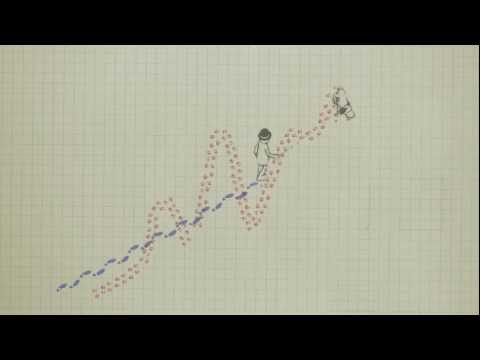
Dork: I explained that bogus idiotic analogy a while back. The dog is determining the man's path. That is bogus. In real life the man determines the relative path of the dog. Apparently you need some more education other than Bill Nye and associates.
ENSO was mostly strong over the period of your graph. That is up to about 1998 when the PDO turns over to cold and now La Nina is more dominant. http://flatearthriskmgmt.com/wp/wp-conte...
That seems to follow the temperatures quite well. A small flattening in the early nineties and the recent flattening. It's almost like ENSO is driving global temperatures or is at least a major factor in causation.
However, ENSO over the past hundred years has been essentially flat so the overall warming trend may be due solely to CO2. However, it's at a rate of 0.07C/decade which would be a pretty low sensitivity, certainly not close the 3C of the IPCC.
Here is a graph that shows PDO
http://www.woodfortrees.org/plot/wti/fro...
Except for when Mt. Pintabo blew, the variations of the temperature trend from linear very closely matches PDO.
When AGW advocates understand that the trends "are" totally natural and climate science is what is trying to put a "mask" on what is really happening with the climate, then people might gain a better understanding of reality. Using temperature anomalies to prove a warming trend caused by CO2 is the best example of "masking" the truth.
If you agree that a 0.07C per decade rise is true, then you can agree that the trend will eventually reverse itself as it always has.
If the Sun changes by 1% and the Earth is 1/1,300,000ths the size of the Sun, then how much of that 1% changes the Earth's atmosphere? Is a 1% change of the Sun's make-up over 150 years possible and measurable if those changes are so small that measuring them are impossible? Is a 1% change possible and not measurable in 50 years? Are we accurately measuring these fluctuations?
We don't even accurately measure Global average temperatures. We use anomalies. So don't tell me that climate science "knows" anything that is dependable and reliable.
Mostly, I think that the world would be a better place without the “Battle of the Graphs.” Graphs are simplified pictures of complex things. You cannot possibly force multi-dimensional things onto a two dimensional surface and expect to retain all of the information. In fact, the real issue is whether a graph contains mostly good information or mostly bad information – and that is a lot harder to know than most people think.
Kano and OM bring up interesting issues. There are multiple cyclonic signals operating simultaneously, but we can only estimate their frequency responses. Almost every signal-analysis technique was developed to find man-made signals. Trying to decompose natural signals is a messy business. You may think that you have some x-number of things going on while, in fact, you really only have some (x-y)-number of things because some things may really be the same thing (i.e., they are not really independent) – and, so, you end up measuring the same thing multiple times without realizing it.
======
Sage ---
>>Dork: I explained that bogus idiotic analogy a while back. The dog is determining the man's path.<<
Where? Who is on the lease? Check out the sequence just beginning around 45 seconds: when the man stops, the dog stops; when the man starts walking, he pulls the lease downward, moving the dog temporarily in that direction until the dog gets to the end of the lease and is forced to turn and move toward the man.
You were dropped on your head a lot as a child, huh?
There is a video in the article below that shows how the natural causes sometimes disguises the long term warming. Unfortunately, the video was truncated when it was edited, and the author has not corrected it - but it is still interesting.
If there was a graph that accurately showed ENSO and temperature back to the year 1000, it should show a warm time and then a gradual cooling to the Little Ice Age and it would show general warming since then with minor variation based on various causes (squiggles (technical term) caused by ENSO, Volcanoes, etc). It seems to me you are showing only a small portion of that warming trend for the last hundred years and implying it is proof of human caused warming or caused by ENSO. IMO it could be proof of what everyone knew long before certain people tried to use recent warming to push their political cause and that is that it was cooler 300 years ago and has generally warmed since then.
The site below lists 55,73,75,88 as strong la nina and 98 as average
http://ggweather.com/enso/years.htm
I don't have any evidence, but some how I believe that ENSA reflect conditions, not cause them, when we have lots of heat entering the oceans, that's when we get big EL Ninos, when we do not get so much heat (like now) that's when La Nina's dominate, unlike the PDO and AMO which are more basic cycles, they are the ones that cause surface temps to rise and fall in waves.
I put this together for another question, but I think it makes the point well.
http://www.woodfortrees.org/plot/wti/from:1983/mean:12/plot/wti/from:1983/trend/offset:0.07/plot/wti/from:1983/trend/offset:-0.07
The point, of course, is that the variation due to ENSO is capable of masking any underlying trend, if you only look at a few years and that conclusions based on any percieved pause are unreliable; premature at best. To put it another way, even if the warming had slowed, stopped or reversed, you would need another decade or two of data before you could reliably make that conclusion. The point is also implied here.
http://en.wikipedia.org/wiki/File:Enso-global-temp-anomalies.png
Now I don't claim mine is the best graph; it was put together in a few minutes for Chem Flunkey's question "When do you think we'll beat '98 with a La Nina year?" The Woodfortrees site is convenient but it does have its limitations.
So my question; does anyone know of a better graph that makes that point? ... or do I need to find the time to put one together myself using Excel?
Thanks in anticipation; if anyone is interested, here's Chem's original question.
http://answers.yahoo.com/question/index?qid=20131114101823AA1bU5I