This is generally not the case with climate date. So, hours of fun, but probably not much use.
Most of the temperature graphs used by the warmists start after the Little Ice Age. This is about as useful as only plotting share prices after the stock market crash. There are many other places to start your trend from and I have presented them previously.
I am sitting in this room. The temperature is 70 degrees F. The furnace comes on. The temperature rises 1 degree in 1 minute. Oh my goodness, in less than two hours my blood will boil!
Do you sit around thinking like that? If you do, I feel sorry for you you.
Also, the sea level is the sea level. There is only one sea level. It may fluctuate in certain places due to things like tides and the like, but it has remained virtually the same for centuries. Just look at St. Augustine, Florida, the oldest city on the continent. It has remained the same in all those years. Just look at artist's drawings of the Thames River, a river at sea level, they depict the same sea level back in the 1400s as we have today.
Quote by Noel Brown, UN official: "Entire nations could be wiped off the face of the Earth by rising sea levels if the global warming trend is not reversed by the year 2000. Coastal flooding and crop failures would create an exodus of "eco-refugees," threatening political chaos."
Ha! Ha! Do you think Gringo and Noel Brown are related?
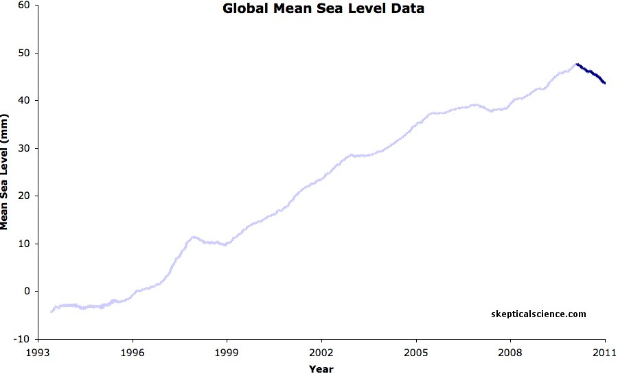
The whole issue with graphicconception's own little graph is that it is severely misleading.
Trend calculations are typically used to spot increases or decreases over a long period of time, filtering out cyclical (natural) variations. And if you want to spot CLIMATE TRENDS you have to look at all the available data, not cheryy-pick your very own start or endpoint as grapphicconception admittedly did: "The time series was short and it showed a sea level rise. I have just shortened it some more and shown a fall. "
What he's done is present a snapshot, not a TREND.
<
Your wording makes it seem as if I deliberately 'added a low value to the beginning of the chart'. I did not. I merely did what real scientists would do: use ALL the available data for this particular sea level gauge and then plot a trend line. The available data starts in 1994, not in 2000:
http://www.psmsl.org/data/obtaining/rlr....
Graphicconception's creative ways with the available data is nothing more but yet another denier exercise of cherry-picking to make it appear climate indicators are moving into a direction favourable to their (political) bias. They've done it with temperature, with Arctic Ice levels and also with Mean Sea levels:
http://www.skepticalscience.com/graphics...
http://www.skepticalscience.com/graphics...
http://www.skepticalscience.com/graphics...
Imagine the data for this sea level gauge actually represent Grapphicconception's weight data which his doctor has ordered him to keep track off. No matter how eager the patient is in deceiving himself into believing he's losing weight by cherry-picking his start point and thus showing a decrease, the doctor (a scientist) will not be fooled, he'll contemplate all available data, spot the increasing trend and tell his patient the unavoidable truth: that he's getting fatter (and that it is best to leave the graphs and the trendlines to professional scientists, not to self-deluding armchair experts).
To Zippie62:
<
Says the tinfoil hat wearing man afraid of Agenda 21/UN Conspiracy Theories. LMAO.
To not use all available data would be problematical. Why leave real data off? You would need a very good reason. Every data point left off would need a very good reason to be left off. eg, evidence produced that the reading was in error say because a seal was sitting on the gauge. [with time stamped pics maybe]. In the absence of good reasons some one looking at your result would be forgiven in thinking you fudged the data to suit yourself.
Trends are to average out the noise and cyclical events. To do this you need as long a time frame as possible.
yes, they are in Climate SCIENCE, not in denier blogs. No real scientist would use 15 year trend as climate.
Tamino has a interesting graphs how this works (link).
There is a problem of signal-to-noise ratio when you try to construct trend lines over short time periods when there is large year-to-year variation. I doubt that any real climate scientists would be convinced by the "trends" that either of you has presented, so why drag climate science into your dispute?
Yes they are. That is why Nobel Prize winning scientists accept that science.
U.S. National Academy of Sciences, 2010:
http://books.nap.edu/openbook.php?record...
“Climate change is occurring, is caused largely by human activities, and poses significant risks for a broad range of human and natural systems.”
http://www8.nationalacademies.org/onpine...
“Choices made now about carbon dioxide emissions reductions will affect climate change impacts experienced not just over the next few decades but also in coming centuries and millennia…Because CO2 in the atmosphere is long lived, it can effectively lock the Earth and future generations into a range of impacts, some of which could become very severe.”
http://www.physics.fsu.edu/awards/NAS/
“The Academy membership is composed of approximately 2,100 members and 380 foreign associates, of whom nearly 200 have won Nobel Prizes. Members and foreign associates of the Academy are elected in recognition of their distinguished and continuing achievements in original research; election to the Academy is considered one of the highest honors that can be accorded a scientist or engineer.”
Trend calculations are however, NOT being used properly by simpleton-level anti-science deniers:
http://www.skepticalscience.com/pics/1_A...
http://en.wikipedia.org/wiki/Climate_cha...
http://en.wikipedia.org/wiki/Merchants_o...
http://www.realclimate.org/index.php/arc...
http://www.newsweek.com/2007/08/13/the-t...
http://jcmooreonline.com/2013/01/31/engi...
The FIRST question is whether the formulas used are themselves correct.
I note that so called "known and provable science" has changed continuously, and that what was true yesterday may be proved tomorrow to be NOT true.
"Science" is, at best, the CURRENT "best guess" in many cases.
Gringo is an arrogant AGW proponent.
If I was Hitler, ..... Kidding. He will come to his own demise. He has no clue of the limits of CO2 warming. Science has given him this, but he denies all of it. He might grow up, but he is in a rocking chair now so I severely doubt that he ever will. He invested heavily in windmills for his retirement instead of saving money on his talent.
Good luck on that Gringo!
Climate Realist - The limits of CO2 warming is well established by nuclear engineers and many other engineers. I don't need a degree in science to understand this. It's simple climate mathematics and science.
Why do you believe in the IP CC? Are you really a socialist? You probably don't understand why the UN promotes the use of fluoride and chlorine in our water systems. This simple fact might help others think that you are a Socialist (which basically means that you may be a Communist. They are basically the same type of Governing tool)
Great post graphicconception! There is intelligent life on this planet!
Drink your tap water Gringo!
Yes everyone is cherry picking the data.
This question is in response to a chart that Gringo posted on this link with regard to sea level at Tuvalu.
http://answers.yahoo.com/question/index?qid=20131017200607AAt3M75
Back to that chart in a bit.
Suppose I were a denier who was trying to prove that the world has been cooling since 1998, or that global warming stopped in 1998. I send over the annual temp data to make my argument, but before doing so I run the program and see a positive trend. So now I cheat, and realizing that people would notice if I changed the number for the record warm year of 1998, I quickly decide to make 1999 and 2000 cooler, lower those by .2C and send over the data. I'm a denier so logically thinking that people have other sources to get temperature data doesn't cross my mind.
Now the problem I have is that if you do a standard trend calculation, finding the line of best fit according to least sum of squares of the differences, this will cause the trend to increase. I made the temperatures colder, yet it now serves to disprove my claim that global warming stopped in 1998. This doesn't make sense, and suggests to me that trends should not be used in this fashion.
Back to Gringo's graph. We can see one outlier in 1998, and the rest of the chart is pretty smooth. If you take away the outlier, which has very low sea level for that year, then the rest of the chart shows a positive sea level trend of 1.5/year. If you include the drop, again a very low sea level point, now the trend is 3.6/year. A 140% increase despite adding a low sea level value.
The reason is because the low value has been added to the beginning of the chart, and trends will thus see more of a low to high slope, but I don't think this is a good use of trend calculations.
Any thoughts?
Cherry picking is a favorite denialist trick.
Zippi
What limits? Whatever limits there are to carbon dioxide warming may be would be found on this site.
http://data.giss.nasa.gov/gistemp/
Who said anything about the IPCC? And the IPCC just reports the science. They don't do the research.
What does my politics have to do with this? If I were the strongest proponent of libertarianism on the planet, it would not change the science.
I understand a heck of a lot better than someone who gets their information from wild conspiracy theories. Fluoride is added to water to prevent tooth decay.
http://en.wikipedia.org/wiki/Water_fluor...
Chlorine is added to remove pathogens from water.
http://en.wikipedia.org/wiki/Waterborne_...
I provided you with the link. The ones you are talking about are sellouts to the oil industry.