It is an effort to hide the decline once again. Under the new definition, temperatures could stey where they are for 20 years, and they would still claim it is consistent with the models.
The graph in the draft was approved by the scientists who contributed to AR5.
The final version of the graph has not been approved by the scientists.
The final version shows a better fit between the models and the observations.
Who do you believe: the IPCC or the scientists?
No, they should not be getting away with this. The media should be asking questions. It could be that the draft really was in error as suggested above but it is difficult to see how the politicians could correct the scientists.
It is interesting to see that the scientists are trying to present the science and the IPCC are not quite so keen. Also, the people here who claim to support science seem to be supporting the IPCC instead.
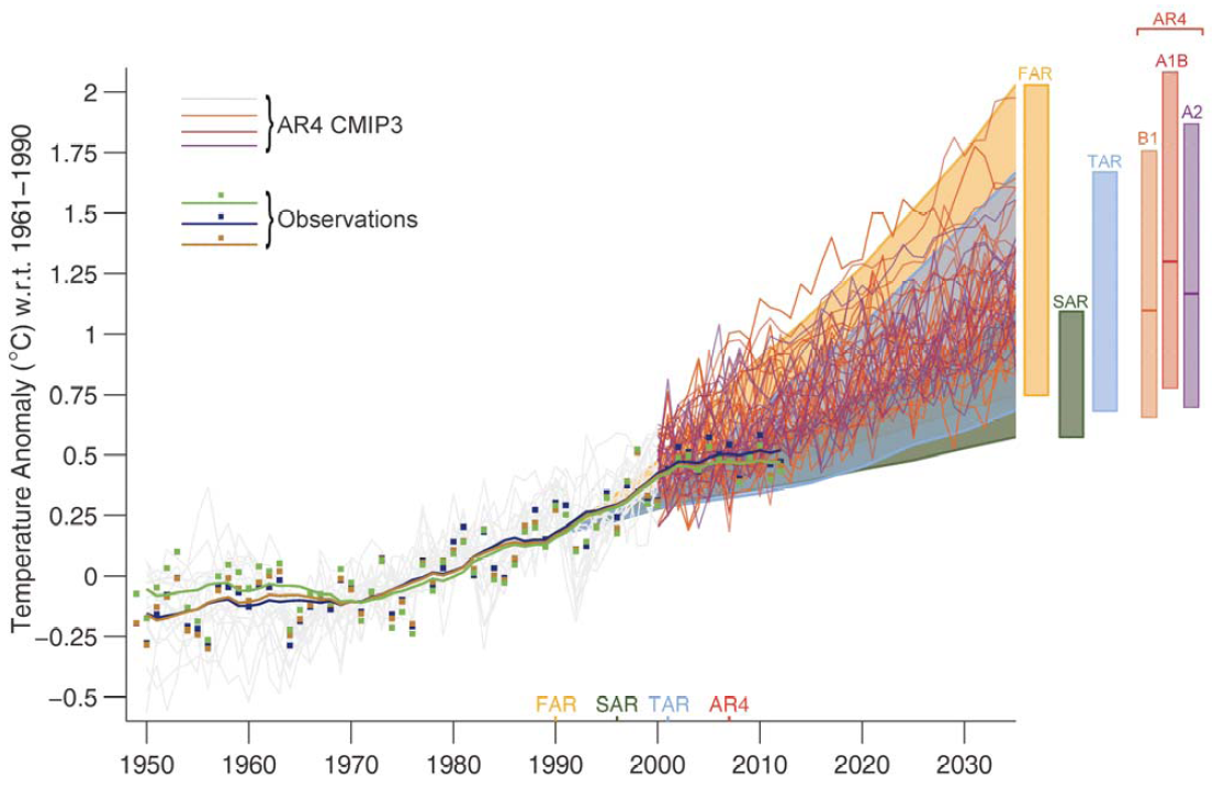
The two graphs use different data. For instance, the latter one from the released report, uses three scenarios from AR4 (B1, A1B, A2) to generate the range of the AR4 models. The figure from the SOD uses only two of those (A1B and A2, I think, which are higher, so including B2 shifts things down for the AR4, you can look it up for yourself if you really care). I don't know why they changed the figure from the SOD to the release, probably because they felt the figure in the SOD was too confusing.
Naturally, McIntyre doesn't bother to point out this obvious difference, and you don't bother to do any checking for yourself. So you got led around by your little nose ring. Again. Really, tell the home office you are tired of this stuff. It doesn't do anyone any good and it only makes you look good to the crazies. But if you're willing to take money for this, at least having the crazies on your side is something. Life is small victories for you, I guess.
The IPCC claims of ocean surface heating reducing due to the hot water being transferred to the lower parts of the ocean just prove that the 209 so called scientists don't have a clue, they have just blown what little credibility they had with their idiotic unscientific ramblings, which any school child would see as rubbish.
Classic "scientific" procedure:
Number One
Ignore or discredit all data that casts doubt on what you "KNOW" to be fact.
Number One A
If number one fails discredit the person who puts forward the data. Decry him as a heretic.
Number Two
If your own data plot doesn't match the "facts" you are trying to prove, replot on different scales/axes until it does.
Lets rephrase your question so everyone understands it: a 'leaked' draft of the IPCC report contained a graph which is different from the one being officially published now by the IPCC. And the reason why is because it was a draft and could (and did) contain errors, errors to be corrected before releasing the official report.
And now that the error in the graph has been corrected in the official report, OM and his merry bunch of science deniers are speculating wildly again and fabricating all kinds of wild conspiracy theories over why-oh-why the two graphs don't match.
God, you guys are so predictable. Almost like our future climate.
http://wottsupwiththatblog.wordpress.com...
http://blog.hotwhopper.com/2013/10/steve...
They have done worse in the past, Mike. Don't forget they made the MWP disappear someplace between the first and the third reports. In the 4th assessment they tried to slip in a scary climate graph from a Norweigan biologist. Sharp-eye "deniers" caught the fraud and the graph quietly disappeared (except for a few screen shots which preserved the original). Fortunately, liberals have short memories and these blatant frauds from past reports are ancient history.
Edit: Now we enter Orwell's realm. The original graph accurately depicted the temperature projection made in the FAR. It was not "in error." The second graph was pulled out of thin air, not from a peer reviewed document.
http://climateaudit.org/2013/09/24/two-m...
http://www.americanthinker.com/blog/2009...
******..."God, you guys are so predictable. Almost like our future climate."
ROFL...Yeah, because climate models are doing a bang up job of predicting it so far :-D
Seriously, thanks for the belly laugh. Alarmists are totally disassociated from reality. It would be hilarious but unfortunately people in power take you ignoramuses seriously.
Are you still sweating the models, Ottawa Mike? Are you still linking to well known and well discredited non climate scientist, Ottawa Mike? Steve is not even a scientist. He is not even a decent statistician. - http://en.wikipedia.org/wiki/Stephen_McI... - Did you grow weary of linking to Anthony Watts?
Forget these useless models, Ottawa Mike. We can do better than this on our own. Let me know when you put all those thermometers in the freezer and then I will run out and see if fixed the decline in the global glaciers.
The new one looks more realistic, like it actually uses computer models. Previous IPCC graphs tended to be strait lines.
Steve McIntyre has already pointed out a potentially very damaging revelation in a post yesterday. The IPCC AR5 final has deleted a graph from the SOD and inserted a brand new graph in Chapter 1.
Here is the original: http://climateaudit.files.wordpress.com/2013/09/figure-1-4-models-vs-observations-annotated.png
Here is the new one: http://climateaudit.files.wordpress.com/2013/09/figure-1-4-final-models-vs-observations.png
Read the entire post here: http://climateaudit.org/2013/09/30/ipcc-disappears-the-discrepancy/
It's not unreasonable to speculate that entire reason the IPCC did this was to diminish and downplay the performance of their climate models. And perhaps the most important aspect to all this is that the new graph is not peer reviewed and it has not be critiqued by any expert reviewers. It was just inserted at the last minute by some IPCC lead author. And make no mistake, this is no Himalaya glacier slip up.
How long will the IPCC and alarmist activist climate scientists continue to get away with this?
the fact that a DRAFT is leaked does not bother you? It was a DRAFT for a reason. The FINAL report was approved by a very rigorous process, unlike climateaudits' blog.
so, unless you have something specific point out why the graph is wrong, keep reading the rest of the 2200 page report.
Just the fact that they display two graphs that are completely different, (without even getting into an argument about, which if any is right) shows that their science is either incompetent or fraudulent.
Cooking their books again . The IPCC does not tell the truth .
They will because they follow the 'Golden Rule', which states, "He who has the gold, RULES."
These people can get caught red handed and they are bailed out by the press, crooked politicians, 'saviors of the earth' on this site and other sites, our educators, and scientists with no moral compass.