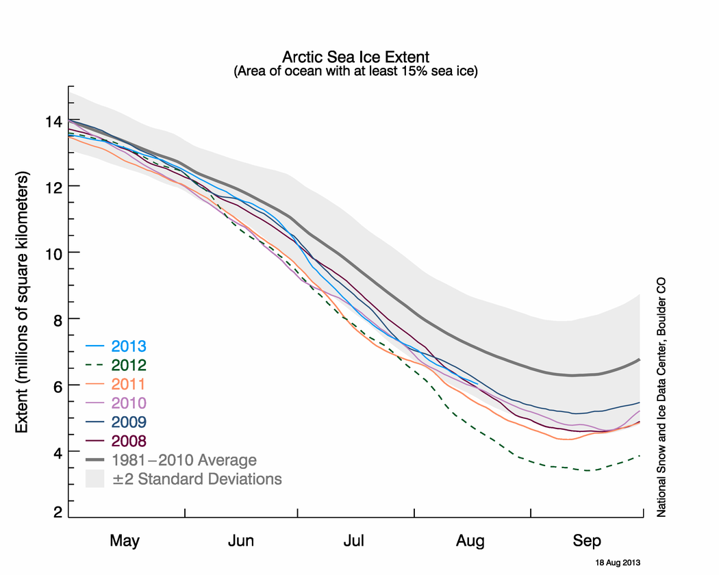
If the ice pack historically averaged 8% at the end of the summer, and last year it was down to 4%, THAT MEANS THAT 50% MORE ICE MELTED LAST YEAR. And that doesn’t worry you? I’m guessing that, for most of you, math was not your friend in school. Stop looking at a graph as a pretty picture, and start looking at the numbers on the axis.
Looking at this year, the ice pack is at 6% or 25% less than historical averages (and still some summer to go). That is still a big number, but let’s look what is influencing that . Record heat in Africa (still this planet) is producing record sand storms which which flow west and are blocking the sun over the Atlantic Ocean – making a cooler Gulf Stream, and fewer hurricanes. Less ice melt this year, but at what cost? The trend is getting worse.
Elsewhere on Planet Earth:
Australia and New Zealand are closing down their hottest summer on record. Just a few months back, the Philippines were hit with their biggest hurricane (they call them Cyclones) in history.
Record wild fires in the U.S., record insurance payouts for crop damage due to drought in the U.S., record flooding in the U.S. The hot item in Alaska was air conditioners - the stores sold out as soon as a shipment arrived. Look where the jet stream was over the past 8 months - that alone should scare the crap out of you.
Climate change is more than one ice pack, or what you see out your window, checking the weather for that day. It’s the entire globe. And if you’re not worried, tune the news away from FOX news for ? hour a day and look at what is happening around the globe.
Good old Jeff M: Flipping charts again. "So OK, if you don't like that one, I've got another one to fool yah!" And you say you don't do exactly what you have done here. HA! HA!
Here is an update that shows we are in big trouble.
The Arctic ocean is warming up, icebergs are growing scarcer and in some places the seals are finding the water too hot.... Reports from fishermen, seal hunters and explorers, he declared, all point to a radical change in climate conditions and hitherto unheard-of temperatures in the Arctic zone... Great masses of ice have been replaced by moraines of earth and stones, the report continued, while at many points well known glaciers have entirely disappeared. Very few seals and no white fish are found in the eastern Arctic, while vast shoals of herring and smelts, which have never before ventured so far north, are being encountered in the old seal fishing grounds. - Washington Post 11/2/1922
Ha! Ha! Isn't this fun watching the 'saviors of the earth' scramble for explanations.
The answer is none. The graphs show that everything is pretty much normal.
Your first and third graphic shows sea ice extent.
Your second graphic shows sea ice area.
Are you aware that the 2013 sea ice melt season is not yet over? While it is extremely unlikely that the sea ice will reach new lows in both area and extent, it is not over yet.
Are you aware that there are other metrics involved in measuring sea ice? Have you considered sea ice thickness? Have you considered sea ice volume, the most important metric used in determining the overall sea ice health?
Who told you that the 2013 Arctic sea ice extent or area would reach new, all times lows? Was it a climatologist or by any scientist that is studying the Arctic sea ice?
Added
flossie, from your link I find this:
" Professor Maslowski's group, which includes co-workers at Nasa and the Institute of Oceanology, Polish Academy of Sciences (PAS), is well known for producing modelled dates that are in advance of other teams.
These other teams have variously produced dates for an open summer ocean that, broadly speaking, go out from about 2040 to 2100."
As I have said to others, you need to check your sources and also see if the article has scientific, peer reviewed support. This article did not have peer reviewed support.
1. Graph 1 and Graph 3 show recent ice extent being below average ice extent. Graph 2 does not show average ice extent as a basis of comparison.
This one perhaps? http://nsidc.org/data/seaice_index/
The only reason you are posting the graphs you did is because it is difficult to tell the trend. Climate change deals with trends not single year occurrences as you seem to be alluding to. I'm sure, though, that you will just continue ignoring this and continue on with your claim that it's all a left-wing nut-job conspiracy.
At the beginning of the year I was asked to estimate the remaining extent, my guess was 4.6 million sq k, looks like I was wrong 4.8 or 5.0 looks more likely.
This is the year that Maslowski predicted there would be no more summer ice left, as reported by the BBC (wrong again) looks like another failed prediction to go with, 50million climate refugees by 2010, and our children wont know what snow is. and increasing numbers of hurricanes (so far none this year)
Which one of these graphs shows Arctic ice decreasing, below its lowest level?
http://nsidc.org/data/seaice_index/images/daily_images/N_stddev_timeseries.png
http://arctic-roos.org/observations/satellite-data/sea-ice/observation_images/ssmi_ice_area.png
http://nsidc.org/arcticseaicenews/files/2013/08/Figure21.png