The second link is not a NOAA graph. It's a Climate4you graph as is clearly indicated on the graph itself. The Climate4you website is run by Dr Ole Humlum.
As is often the case with fake skeptics relying on websites rather than peer-reviewed journals to publish their thoughts, someone claiming his/her graphs to be based on NOAA does not make it so. Real skeptics take such a claim with a grain of salt.
Edit @ OttawaMike:
<
You're the one instantly believing Humlum's data to be correct (to the point that you even label his graph as a NOAA graph), not me.
The OLR is lagging the temperature rise which is to be expected, when the Earths temperature increases of course OLR has to increase.
I see nothing unusual here, during this period earths temperature gradually rose so of course it emitted more OLR.
What is interesting is the big time lag, it shows that very little long wave radiation is emitted direct from earths surface to space, and most is from the top of the atmosphere (TOA)
I can see no data showing that GHG are having an effect on our atmosphere.
Also to be considered is not all the OLR is coming from earths surface some is reflected from the atmosphere, and some is upper atmosphere warming, which is affected by UV which varies a lot more than TSI.
It certainly seems that high temperature is correlated to low emissions of long wave radiation. It also seems that correlation is better recently. There appears to be a slight lag in the temperature graph compared to the LW radiation.
The last link apparently only shows three years but I could not open it to read it in detail. I don't know why the total spectral output isn't studied in a more comprehensive manner. I don't see how a relatively stable (albeit increasing) concentration of CO2 can result in the varying temperature as shown on the graph in the second link.
Clearly it seems that varying CO2 concentrations weren't resulting in the peaks and valleys in the temperature graph.
What alarmists will probably argue is that CO2 is responsible for the gradual increase from 1979 to present and not the peaks and valleys. That is natural variation but it certainly seems natural variation overwhelms the slight increase in temperature. I don't see a lot of evidence for that either except they apparently claimed the limited results in the final link showed that less radiation being emitted in the bands absorbed by CO2.
I would like to see a graph of complete spectral analyses that is similar to the graph in the 2nd link. I suspect it would be inconclusive.
I gave TD to ******; his argument was an ad hom and thumbs up to Jim Z. Although, I kind of wonder why skeptics seem to have a trouble with the idea that both carbon dioxide and natural factors could influence weather and climate.
As temperature increases outgoing longwave radiation increases. This is a basic concept. As the temperature of an object increases so does it's outgoing radiation. From your post you don;t even understand this basic concept. Why is that? You allude to specific breakdown of frequencies further along in your post. This is what you have to look at.
"As is often the case with fake skeptics relying on websites rather than peer-reviewed journals to publish their thoughts"
I guess you think quarks neutrinos and molecules are crackpot ideas, being that these concepts were originally rejected by the Church of Peer Review. Indeed, "molecules" were originally ridiculed by the most respected physics journal in England.
You Authoritarians really are not all that much better than the Deniers.
There's a EPA job waiting for you here in the U.S. if you are looking to make over $200K.
:-)
Satellites have been monitoring outgoing longwave radiation (OLR) for many years now. I have two different NOAA graphs which show this:
http://www1.ncdc.noaa.gov/pub/data/cmb/teleconnections/olr-s-pg.gif
http://www.climate4you.com/images/NOAA%20CPC%20EquatorOutgoingLWradiationAnomalyMonthly%20and%20HadCRUT3%20since1979%20With37monthRunningAverage.gif
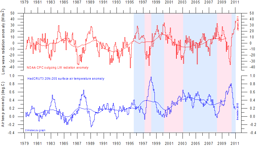
I'm not sure but I believe both graphs are just different representations of the same data. And it is clear that OLR has been increasing for the past 35 years. So on to some questions:
1. Assuming the NOAA data is good, how can OLR be increasing, temperatures be increasing and CO2 be increasing the greenhouse effect all at the same time?
One answer might be to point to a study that shows the spectral breakdown of the OLR and that the bands for CO2 (and other GHGs) shows a drop. For example: http://proceedings.spiedigitallibrary.org/proceeding.aspx?articleid=849920
2. If if the CO2 band shows a drop, doesn't the overall increase in OLR indicate that CO2 is not a main factor and it is being overwhelmed by something else?