Ottawa Mike, we do link to peer reviewed science articles when the topic is actually about science. Your topic is on how to distract from the science. Should you have concerns about the "picture" then take your concerns to art students or art masters.
1. Drafts would not have been released to public without consent and they would most likely have been done so to be taken out of context. ... Much as you try to do here. As an engineer, as you have said, would you take a draft drawing and represent it as a finished product?
2. The data that the graphic depicts was certainly peer reviewed. Should the graphic show different than what the data shows then it would quickly be brought to everyone's attention. That is a part of the IPCC process.
3. A similar graph? Similar in what ways, Ottawa Mike? Be more specific. Here, take a look for yourself and see if what you call similar exists or not - http://www.ipcc.ch/publications_and_data... - It is free and it is freely accessible to all.
4. Is this technique of data presentation used in any of the other sciences? Yes
Examples?
Geology - http://www.trilobites.info/geotime.htm
Glaciology - http://www.scimagojr.com/journalsearch.p...
5. The graphic clearly states 1850 - 2012 so all decades would be included from
1850 - 2010 2011 and 2012. Did you not see this on the very "picture" that you linked?
6. Who drafted this figure???? The Seattle Seahawks? What do you mean by, "who drafted this figure"?
Added
The IPCC report is on the science. Your question is about a graphic in the report and not on the actual science in the report. You are merely making an attempt to distract from the messages that the IPCC report contains. Should you feel insulted that I would call you out on your question that is designed to be nothing more than a distraction then you have true issues in dealing with science. And no, I do not believe you to be so thin skinned. You have a good personality. You just have a problem with science when the science does not support your ideologies. This is an indication that you have not yet reached a very high level of intellectual honesty.
No answer will satisfy you if you consider the IPCC, the largest single review body of climate scientists, as 'alarmists'.
In any case the IPCC report is peer-reviewed.. It is peer-reviewed by more scientists than a scientific journal paper would be. Has it appeared before? Yes, decadal averages have been used in multiple IPCC reports ... search for 'decadal temperature average' in google.
Which form of 'data presentation' are you referring to? Graphs? Averages? I'm not sure what you mean.
Would the data look different? Yes it probably would. But that is covered by the standard deviations in the data.
1. No.
2. No - but it is a plot of the data.
3. Not as far as I know.
4. A definite maybe to that one.
5. Not really.
6. Pass.
(Peer review is cleverly manipulated by the IPCC. Up to 30% of papers in the report are not peer reviewed. Pachauri tells the gullible that this is the Gold Standard and everything is peer reviewed. They often are not written by scientists. Also, when they detect some points need emphasis they request scientists to create the papers then they are all published in a special edition of journal created just to "launder" the papers and make them eligible for inclusion. This is last minute so the other scientists do not get access in time to make an adverse comments.)
A cynic might say that the reason for plotting decadal averages is to hide the pause. As every group thought every other group was looking at the pause it is probably better for them not to emphasize it.
The other point is that most graphs that warmists are happy with always start after the Little Ice Age. Surprisingly(!), after the coldest period in hundreds of years temperatures rose - just the same way that every straight road has a corner at the end.
It is like plotting share prices after the stock market crash. Look, overall they have all gone up!
It is only a graph, just like this:

1 very likely
2 Scientific papers are peer reviewed in a professional journal. If the graph were contained in the paper then it would be peer reviewed
3 Very likely since the decades in question are 60s, 90s, and the oughts
4 Yes Biology for one also sociology
Not sure about 5 ans 6
That's funny Mike! The graph shows a global average temperature cooling (plots are at or below the global average temperature) until around 1980 and then it rises 0.2C every 10 years for the next 30 years and they do it consistently according to the graph (an even stair-step upwards). Now that's a Hockey Stick!
Sagebrush has a point. We have to understand that we are talking about global average temperatures where the natural temperature variations are just that. Variations. Averaging them over a decade is a stretch when we know that temperatures can fluctuate naturally by quite a large margin in a short period of time without the help of any outside influences (like CO2).
The bottom line is what the global average temperature "is" now (0.62C above the established global average temperature - Aug 2013) and it is much cooler than what it was in 1998 and last year (0.90C above the established average temperature). It doesn't matter what the "average of the averages" through any decade was. Read the thermometer as it is now! "Global Warming" is 0.62C above the established normal temperature as of right now. Now determine if this 0.62C warming is anthropogenic or if it is more of a natural increase. We already know that the "runaway greenhouse effect" doesn't apply at this time.
Here was the graph before they had a financial and political incentive to modify it.
http://climateaudit.org/2008/05/09/where...
Then it showed something like this in 1996
http://en.wikipedia.org/wiki/File:IPCC_1...
In 2001 Mann-made warming showed this
http://wattsupwiththat.com/2013/08/21/ip...
Now the one you showed.
GCNP calls that evidence. I call it something else. Is it peer reviewed? I am sure it is. So were the others. It will be interesting to learn the answers to your questions and interesting how it plays out.
1-6: It's kind of scary when objective evidence isn't lining up with what you want to believe isn't it?
The IPCC does synthesis, meaning they are allowed to do analysis of existing published data. Calculating decadal averaged temperatures from existing temperature records falls into this category. If you think that somehow the data would look different if you used different decades, why don't you plot it yourself? It likely doesn't make a difference, or else that figure would be all over the climate skeptic blogosphere, and it ain't.
God damn I am glad I am not you. It must just suck to wake up and know you have to post stuff like this to get paid.
This hasn't happened according the confirmed data. They may be taking sectors and calculating them, but the accrued temperature over the last decade is definnitly showing a downward trend. And James Hansen has had to admit this. And Phil Jones so much as admitted this. (I know it is poor English, but I am doing it for emphasis.) So they are blowing smoke. There hasn't been any accumulative increase in any decade since 1998. PERIOD. END OF ARGUMENT.
That is a bogus claim anyway the 1930s were hotter.
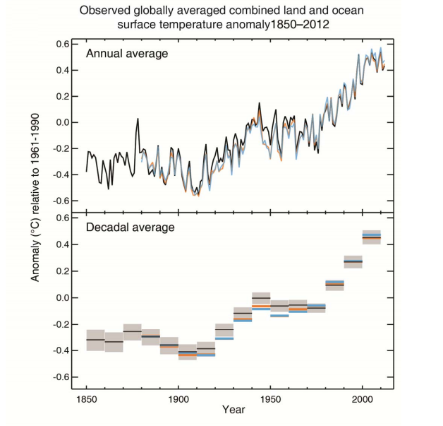
The following is a favorite saying around by warmists and of course they get it from the IPCC and other alarmist scientists. Here it is from the latest SPM (with a picture):
"Each of the last three decades has been successively warmer at the Earth’s surface than any preceding decade since 1850 (see Figure SPM.1). " http://www.climatechange2013.org/images/uploads/WGIAR5-SPM_Approved27Sep2013.pdf
The figure is in the link on page SPM-27 but here is a direct link: http://images.huffingtonpost.com/2013-09-27-Picture322.png
I have a couple of questions about that graph:
1. Did this figure appear in the draft SPM which was put up for expert review?
2. Is that graph peer-reviewed: i.e. does it appear in a peer reviewed journal publication?
3. Has a similar graph ever been used in previous IPCC reports?
4. Is this technique of data presentation used in any of the other sciences? Examples?
5. Would the graph look different if different slices for the decades were used? (Did they use 0-9 or 1-10?) (Is 2011 and 2012 included?)
6. Who drafted this figure?